Photometry & Colors API
Introduction
This section illustrates the API that was developed to solve photometry-related and
color-conversion-related problems to compose the applications cubeed.py and splisted.py.
Some usage examples of this API in further contexts are shown below.
Examples
Plot bandpass filter shapes
import aosss.physics as ph
import matplotlib.pyplot as plt
import numpy as np


l0, lf = 3000, 250000
x =  np.logspace(np.log10(l0), np.log10(lf), 1000, base=10.)

ax = plt.subplot(211)
for name in "UBVRI":
    bp = ph.UBVTabulated(name)
    plt.semilogx(x, bp.ufunc()(x), label=name)
plt.xlim([l0, lf])
plt.title("Tabulated")

plt.subplot(212, sharex=ax)
for name in "UBVRIYJHKLMNQ":
    bp = ph.UBVParametric(name)
    plt.semilogx(x, bp.ufunc()(x), label=name)
plt.xlim([l0, lf])
plt.xlabel("Wavelength ($\AA$)")
plt.title("Parametric")
l = plt.legend(loc='lower right')

plt.tight_layout()
plt.show()

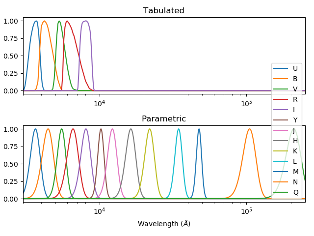
Figure 2 – Bandpass filter shapes in both tabulated and parametric formats.
Passing spectrum throught bandpass filter
import aosss.physics as ph
import matplotlib.pyplot as plt
import numpy as np

BAND_NAME = "B"
STYLE = {"color": (0, 0, 0), "lw": 2}
sp = ph.get_vega_spectrum()

bp = ph.UBVTabulated(BAND_NAME)
filtered = sp*bp
x_band = sp.x[np.logical_and(sp.x >= bp.l0, sp.x <= bp.lf)]

ax = plt.subplot(311)
plt.plot(sp.x, sp.y, **STYLE)
plt.title("Source Spectrum (Vega)")

plt.subplot(312, sharex=ax)
plt.plot(x_band, bp.ufunc()(x_band), **STYLE)
plt.ylim([0, 1.05])
plt.title("Bandpass Filter (%s)" % BAND_NAME)

plt.subplot(313, sharex=ax)
plt.plot(filtered.x, filtered.y, **STYLE)
plt.title("Filtered Spectrum")
plt.xlabel("Wavelength ($\AA$)")

ax.set_xlim([bp.l0-100, bp.lf+100])
plt.tight_layout()
plt.show()

Figure 3 – Original spectrum, bandpass filter, and filtered spectrum.
Magnitude of spectrum for several bands and systems
The following example compares flux-to-magnitude conversion of the Vega spectrum for different magnitude systems.
import f311.physics as ph
import tabulate
systems = ["stdflux", "ab", "vega"]
bands = "UBVRIJHK"
sp = ph.get_vega_spectrum()
rows = [([band]+[ph.calc_mag(sp, band, system) for system in systems]) for band in bands]
print(tabulate.tabulate(rows, ["band"]+systems))
This code results in the following table:
band        stdflux          ab    vega
------  -----------  ----------  ------
U        0.00572505   0.761594       -0
B        0.0696287   -0.10383        -0
V        0.0218067    0.0191189      -0
R        0.0359559    0.214645       -0
I        0.0661095    0.449825       -0
J       -0.0150993    0.874666       -0
H        0.0315447    1.34805        -0
K        0.0246046    1.85948        -0
Convert spectra to RGB colors
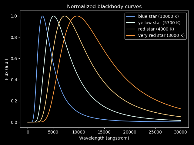
The following code plots blackbody spectra using color calculated from their respective spectra. This procedure can be applied to any spectrum.
# Plots blackbody curves (normalized to max=1.0) for red, yellow and blue stars;
# Calculates colors for these stars

import matplotlib.pyplot as plt
import numpy as np
import aosss.physics as ph
import f311

# color, temperature (K)
stars = [("blue", 10000),
         ("yellow", 5700),
         ("red", 4000),
         ("very red", 3000),
         ]

h = 6.626e-34
c = 3.0e+8
k = 1.38e-23

def planck(wav, T):
    """
    Calculates blackbody curve. wav in angstrom, T in kelvin. Returns intensity vector

    Adapted from https://stackoverflow.com/questions/22417484/plancks-formula-for-blackbody-spectrum
    """

    wav_ = wav*1e-10 # converts to m

    a = 2.0*h*c**2
    b = h*c/(wav_ * k * T)
    intensity = a/ ((wav_ ** 5) * (np.exp(b) - 1.0))
    return intensity

# x-axis wavelength in angstrom
wavelengths = np.linspace(10., 30000., 1000)

plt.style.use("dark_background")
for name, temperature in stars:
    flux = planck(wavelengths, temperature)
    flux /= np.max(flux)
    color = ph.spectrum_to_rgb(f311.Spectrum(wavelengths, flux))
    plt.plot(wavelengths, flux, color=color, label="{} star ({} K)".format(name, temperature))

plt.legend(loc=0)
plt.xlabel("Wavelength (angstrom)")
plt.ylabel("Flux (a.u.)")
plt.title("Normalized blackbody curves")
plt.tight_layout()
plt.show()

Figure 4 – Blackbody spectra painted with colors calculated from the spectra themselves.